
2013-10-03
Tablet Friendly Menus
Making your website's main menu friendly for tablets and smartphones
Author:
Topic:
Series:
Tablet Friendly Menus
Affected Items:
Tablets and smartphones using both Android and Apple iOS, although Apple devices seem to have more issues with menus.Issue:
Devices which depend on touch such as Tablets and Smartphones lack the ability to 'hover' over a menu like a desktop or laptop can do with a mouse. Hovering causes modern menus to drop down revealing submenus and since touch devices lack this ability, they depend on a double touch. The first touch activates the dropdown menu, the second touch in the same spot chooses the menu item. Older Apple devices may not work even with this fix.Reason:
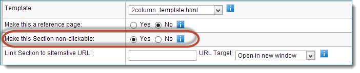
If you do not setup your webpages properly, you can cause a problem for touch devices trying to use your website's menu. This only happens when you choose Yes for the option 'Make this Section non-clickable' in the Edit webpage options.
Screenshot 1 - Shows cause of issue
Fix:
Change the above option to No. Now insert content into this page if you have content.If you don't have content for this webpage, which is why you might have said Yes in the first place, there is an alternative method. After changing the 'non-clickable' option to No, use the next option called 'Link Section to alternative URL' to link this page's menu to a subpage instead. To insert a link, open a subpage in another browser window and copy the URL.
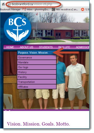
Screenshot 2 - Copying Link
If you don't have content for the 'ABOUT US' page, force the menu to display the 'Purpose, Vision, Mission' webpage instead. After going to this subpage, copy the link in the top (shown in the red circle below).
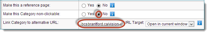
Screenshot 3 - Paste Link
Paste the link into the option shown below.
Your main menus are now Tablet and Smartphone friendly!
IMPORTANT
We design websites to work on generic desktop/laptop computers and mobile devices. but cannot support every device which views your website. There are so many manufacturers and models of hardware, plus all different versions of software available for them, that supporting them all is impossible.
What can be done:
- Make sure your devices are running the latest software and firmware
- Old devices may never be able to use all the features we build into the website so you may need a newer device.
- If your website is partly to blame, we can provide you with an estimate to update your website
We are constantly improving our methods, coding, design, and accessibility and if there are limitations due to your website, we can upgrade it. We are excited with the progress we have made on our Mobile website solution that is not as dependent on your website's age. If you want to offer a faster easier to use website for mobile devices, our Mobile module solution seamlessly integrates into SiteApex.


