|
||||||||||||||||||||||||||||||||
| Define the relationship of every element |
In Example 6.1 below you can see how alignment pays immediate dividends. Elements on this page are now connected by alignment which helps your eye determine their order of importance. Readers can now quickly identify the priority of each element. Each of these elements has a slightly different purpose but are all related and need to be visually connected.
 Example 6.1 Effective Alignment Example 6.1 Effective Alignment By lining elements up, this page looks much more professional. Notice that every element on the page has a visual connection with another element and positioned deliberately instead of randomly. Also notice the strong line down the center which adds interest. |
|
|
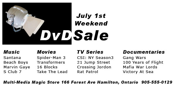
Another advantage of alignment that is evident in the example above, involves grouping. If you want to free up more space to add more elements, alignment can be used to do just that. Take another look at Example 1.2 and Example 6.1 and count the number of titles offered. You will notice that the unaligned flyer has 8 and looks crowded. The aligned flyer has 16 and doesn't look crowded. Actually, it still has space above 'Documentaries' to put more. Amazing, isn't it!
 7. Using Lines
Take a look at the next two examples. Which example gives a cleaner and more professional appearance upon a first glance?
|
Example 7.1 |
Example 7.2 |
||||||||||
|
|
||||||||||

Example 7.1 is a typical design that ignores the rules of alignment. Some elements are centered, and others are not. 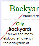 As a result, few connections are visible and the page looks disjointed. Be careful of unwanted 'rogue' lines. The red line at left illustrates an unwanted line being created in the newsletter above. The blue rogue line illustrates a second line that jumps out due to the strong fonts and the fact both are the letter 'B'. These lines create a disjointed look for the reader and should be avoided.
As a result, few connections are visible and the page looks disjointed. Be careful of unwanted 'rogue' lines. The red line at left illustrates an unwanted line being created in the newsletter above. The blue rogue line illustrates a second line that jumps out due to the strong fonts and the fact both are the letter 'B'. These lines create a disjointed look for the reader and should be avoided.Example 7.2 adheres strongly to the principle of alignment. All text, headings, and the photo are now flush left. The overall look of the updated newsletter is cleaner and more professional looking.
|
Example 7.3 |
Example 7.4 |
||
|
|
When using flush left alignment, especially in a narrow column, try to make the right edge of your text as smooth as possible. Taking a few minutes to alter your wording can make a big difference as shown in these two examples. Example 7.3 has a very uneven right edge. By altering the wording just slightly as in Example 7.4 the paragraph takes up less space and the right edge is now straighter.
If space is a premium and extra line spacing is not an option, you can distinguish new paragraphs with a small indent, but only use two spaces and not five. Paragraphs under titles do not need to be indented.
Example 7.3 illustrates the incorrect method for indenting and the effect it has on the look of the paragraph. Example 7.4 is easier on the eyes to read.
8. Using Blank Space
There are two approaches when combining text and photos. The one you use depends on the relationship between them. If the text beside the photo is describing the photo then it is often better to align the words along the hard edge of the photo, such as Example 8.2 illustrates. If the relationship is not as close, you can use the method that Example 8.1 illustrates.
| Avoid trapped space |
|
Example 8.1 |
Example 8.2 |
||
|
|
||
|
Remember, when you find a strong line, use it to your advantage and stick to it. Use the strong edge of the photo and align your text against it to build a relationship between text and photo. |
|||
Take another look at Example 8.2 and notice that the use of alignment created blank space in the top left corner. Don't be afraid of extra blank space and instead use it to give your viewer a place to enter into your content. If this space was filled with more content, it will make it more difficult for the viewer to see a natural opening. In Example 8.1 the space is 'trapped' between the title and photo so it does not have the same effect.
9. Using Your Eyes
These are a few of the smaller things that people sometimes overlook when they are aligning elements on a page.
-
Captions under photos that are not aligned the same as other elements
-
Pictures that are slightly out of alignment with surrounding elements
-
Text that has both center and flush left or right alignment mixed
-
Headlines, titles, and subtitles that are not aligned with the paragraph text
Learn from other quality designed print material such as magazines, books, advertisements.
Summary of Alignment
Every element on a page must be deliberately placed so that it has a visual connection with other elements on the page. No matter what style you want to achieve, alignment is vital to creating a professional look. When all the elements on a page are visually connected the page looks unified.
Alignment is the key to organization and creating a page that is interrelated, connected, and unified. A well aligned page takes away the viewer?s uneasy feeling when reading your page. A unified page is appealing to viewers and draws them into reading your content.
You much consciously place every element on your page. Always find something else on the page that it will be connected to before you place each element. Create strong invisible lines between different elements of your content. Remember that even elements that are far away can be aligned to each other.
- Using more than one text alignment on a page (ex. Don?t center some text and right align other parts)
-
Automatically center aligning everything. If you are going to center align, do so consciously and for a specific purpose