|
|
 Rule 1:
| NOTE: We have included the point sizes below so you can see what size font was used. |
 Examples Examples1.1 Barely Different
(10 pt) (12 pt)
1.2 Noticeable Different
(10 pt) (14 pt)
1.3 More Different
(10 pt) (24 pt) |
1.4 A Lot Different
(10 pt) (36 pt) 1.5
|
To create these obvious differences on a website you can use any of the following methods listed below. Sometimes it is necessary to use more than one method on one element to achieve the contrast needed.
|
The hardest part of using contrast is pushing yourself outside your visual comfort zone. From your point of view, some of the changes suggested here will seem extreme, maybe even crazy, but you have to push yourself. Contrast usually seems more extreme from the designer?s perspective than from the viewer?s perspective.
 2. Contrast Includes Navigation
| NOTE: Some of the example graphics in this tutorial do not use actual text but rather thick and thin lines to illustrate font sizing. This helps you visualize the overall impression of the document without relying on actual words. |
Compare the next two newsletters. Which one looks more interesting, engaging and easier to skim through? Both newsletters have the same content, both have used alignment and proximity principles correctly. They are the same in every respect except for the use of contrast.
| Your eye needs an entry point which a sidebar like this can provide |
Example 2.1 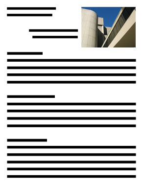 |
Example 2.2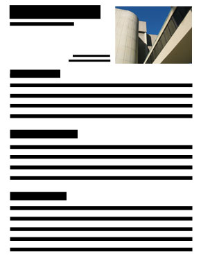 |
| Font size creates the contrast needed |
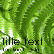
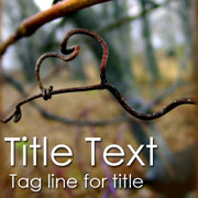
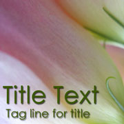
The newsletter in Example 2.2 is more engaging and gives your eye a place to enter and start skimming. Font size is the only difference between these two newsletters. Instead of one font size there are now four.
- Top title font: With this large font it now jumps off the page.
- Title tag line font: The line under the top title makes it look like a tag line or slogan because the font is much smaller which also makes the heading font look even larger. People will now read this tag line to get an idea of what the article is saying.
-
Photo font: Using a smaller font beside the photo does not interfere with the alignment of the page. It is now seen as a description of the photo which is a very useful strategy for luring people into your content.
-
Paragraph fonts: A majority of the content uses a standard font size except the paragraph titles which gives the viewer an easy way to skim over the article before deciding to read it. These titles also break up the article's thoughts and turns an otherwise chunky article into bit sized pieces for easier skimming. When contrast is used correctly like this, it can actually make content look lighter and easier to read.
3. Contrast Includes Organization
Without reading any words a well organized layout helps people determine if they are looking at a page from a novel, a magazine, a product warranty card, a wedding invitation, a theatre bulletin. Each one has a unique layout that most people can easily identify. As a result, organization is critical in helping a reader quickly interpret your documents. Contrast can greatly enhance the organization of your page by making more important elements clearly stand out. In Example 3.1 below, you would have no idea what the document was about without reading it. In Example 3.2, the document has a familiar layout. Contrast is now being used to organize title elements, sections, and points. The result is a layout that gives you a clue as to what type of document it is. Can you identify it?
| Your eye wants to identify the page before reading it |
Example 3.1 is a common mistake many people make when designing this type of document. The result is a very boring page with nothing to help the reader interpret what it is, much less grab their attention. In Example 3.2 the headings and subheadings are now bold and much larger, contrasting with the rest of the text. This helps the reader distinguish the main points. The blue horizontal lines contrast with the strong vertical alignment down the middle. All of these contrasting elements help in identifying the page as someon's resume.
Example 3.1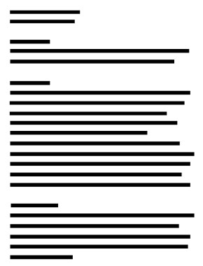 |
Example 3.2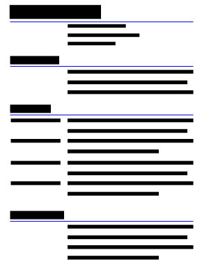 |
The easiest way to add organizational contrast in a document is by using different fonts, however, don?t ignore other elements such as lines, colours, and spacing which are equally as important.
 Let's use this principle in more practical situations such as designing a list. If you gave the person organizing a camping trip the checklist shown in Example 3.3 they may find it functional but very cumbersome to use. They will have to categorize the items in their mind before assigning people to gather these items for the trip. Even the title is not contrasted enough.
 In Example 3.4 the checklist is a lot easier to interpret because it is now divided into categories using the thickness of different lines. The reader can quickly see where each category starts and ends.
Example 3.3
|
Example 3.4
|
If you do not want to use lines like the examples above, use a larger font size for category headings and add an extra line space between each of the three categories. This technique can have the same effect as using horizontal lines.
|
TIPS Remember these simple tips for contrasting elements
Colours: If you are contrasting colors, make sure they are not too similar. If you cannot easily see the difference, either will your readers. Especially with text, avoid putting colours together like black and dark blue or deep red and burnt orange. In the camping list examples we used bright blue lines that are easily distinguishable from the black text.
Lines: When using lines to separate sections of your document, be sure to use a common thickness for similar items and an obvious difference in thickness to designate dissimilar items. In Example 3.4, the thicker blue lines act as grouping elements for similar items.
Spacing: Spacing is not always easy to master but when used correctly makes a great improvement in the readability of your page. It can be used between lines of text, words, or even individual letters. It can also be used between photos, paragraphs, titles, border edges, and any other elements.
Blank Space: Any area within your content that does not compete with main elements on your page is called 'white space' or 'blank space'. When people refer to 'white space' it does not mean the space is literally coloured 'white', but rather a less busy background not competing with other more important elements on the page. Blank space can include one colour, simple graphics, or a plain background in a photo. Blank space offers the opportunity to create contrast, and gives the reader's eye a place to enter your text. In the sample title pages below, the text is left and bottom aligned leaving space above and beside the text. However, this does not ensure true 'blank space' as you will see below.
|
4. Contrast Includes Importance
| Content elements do not have equal importance |
A common design mistake is when elements are given equal size and weight. To a viewer, this looks like every element has the same importance. If every element on the page is the same, it leads to boredom. If too many elements are emphasized, it leads to confusion. If some elements need to be emphasized and others not, you need a method to define which is which.
To avoid being trapped into thinking every element is equally important, and they are not, ask yourself the following list of questions before designing your page.
Questions For Determining Importance
-
Who are you targeting in the webpage or document?
You need to know your target market. This will put your content into context so the right people can identify that your offer is for them. Contrary to popular belief your target market is not 'everyone'. Not even an ice cream parlour caters to everyone because some people don't eat it.
Knowing your target marketis a great starting point and likely the most important, especially when beginning to design your page. Sometimes your target market is not as obvious as you may believe. If you own a children's toy store, your target market is not likely the children. To help you determine your real target market, first consider the researcher that will examine your product or service and then consider the decision maker who will buy into it.
-
What is one of the greatest benefits you offer people?
What makes your product or service worth considering from your target market's point of view? Chose one unique quality to capture their attention that perhaps your competition is not using.
If possible, combine this answer with your answer to the first question, since they are often tied directly together. If you sell sugar-free fat-free ice cream (and we all wish it could taste good) then your target market may be diabetics or overweight people trying to lose weight. A photo of a person licking ice cream while jogging may help identify who you are targeting or you may add a text slogan such as: Ice cream for those who shouldn't. Keep in mind that the benefit is even more important than who you are targeting since we can sometimes target our message by way of the delivery method.
-
What are the facts that backup your claims?
Facts are the strength of your message and give your target market a perceived value which either repels them or pulls them towards a response.
This will make up the bulk of your text and becomes the opposite contrasting element on the page that will help other elements stand out. It should not compete with the above two elements (benefits and target market). Facts can include numbers, studies, testimonies, and comparison charts.
-
What are the features that provide the benefits ?
Features include anything you possess which enables you to provide the benefit you claim to offer.
The most common mistake designers make is to emphasized features on their website or advertisement instead of the benefits of using these features. The purpose of features is to support the benefit and not compete with it. As a result it should be part of the bulk of your content and not the emphasis of your content. The ice cream palour may talk about the substitute ingredients they use, or some patented process to remove sugar and milk fat while retaining the good taste.
-
How do they respond to your offer?
They need to know how to contact you to complete the response you are after. Make it clear but do not make it the most important element on your page.
This is easy to define and often where most amateur designers put their emphasis. It should never compete for attention over the first two answers above. The reason is simple; if a person is really interested in your offer they will find your contact information.
Priority Of Importance Demonstrated
The priority of importance is shown in the next few examples. Items with more importance become the entry point for readers to get into your content. If all the elements are the same size and weight, there is no priority list of importance and therefore no entry point. So it is vital you create an entry point by using strong contrast. Also, don?t be afraid to use 'blank space' and smaller text to contrast with headings. Both of these allow for easier reading. Look at the first two advertisements below. Which one captures your attention?
|
Example 4.1 In this advertisement example, your eye has no idea what the designer considers a priority and therefore no clear entry point. Every element except the leaf is similar in size and weight making the leaf look out of place. The horizontal line near the top which was supposed to enhance the title, now divides the ad creating confusion, |
|
Now we will add contrast to pop this advertisement off the page.
 Example 4.2 Example 4.2After a few contrast changes the advertisement is much more interesting. With larger fonts at the top, the horizontal line now enhances the title instead of dividing the ad.
Your eye has an entry point at the top, the flush left alignment is enhanced with side by side lists, section groupings are now more pronounced allowing the reader to quickly skim the content. The heavier font phone number and leaf now compliment the title, which helps to frame the ad. Notice too, the actual line spacing is the same as the example above. The larger fonts just make it more pronounced. |
|
What happens if we try contrasting it differently?
|
Example 4.3 This example almost reverses the contrast from the previous example. Now your eye is drawn immediately to the words 'Design & Build Landscapers'. Since the company name is not really as important as what they offer, it is also less prominent. Now instead of the phone number framing the ad, it is their membership information which lends legitimacy and credibility.
Since 'Free Estimates', is more important to the viewer than the phone number, it is given a larger font size.
The same line spacing was maintained in this example but the effect is quite different. |
|
What happens if we add colour to the design?
|
Example 4.4 Solid colour is now used as the primary contrasting method. The leaf draws attention to the 'Design & Build Landscapers' text. Letters GDH are large but given less importance since they are used as a design element looking like building blocks which do not compete with the more important word 'Landscaping'.
The phrase 'Free Estimates' frames the ad and works like a springboard for the viewers eyes to bring their attention back up to the title. If this phrase had a much smaller font, their eyes would fall off the bottom of the ad and into the next ad. This phrase will also be perceived as a benefit which needs to stand out. |
|
Summary of Contrast
Contrast is one of the best tools to draw a viewer's eyes into reading a page. Our eyes actually enjoy contrast and look for elements that stand out from other elements. When contrast is done properly, it makes documents come alive, provides viewers with an entry point, allows them to skim easily through important details, and if interested be drawn into reading the rest of the text. Without contrast the page looks dull and boring and will often be ignored.
Why use it?
There are three reasons to use contrast.
Visual Interest: Once the person sees a contrasted element, they are drawn in through that element. This acts like an entry point or doorway to the rest of the content.
Organization: It helps organize your content on the page by providing navigation points. When you contrast key elements that summarize your document, such as headings and subheadings, they will be the first thing the viewer reads. This assists your readers by making it easy for them to scan your content quickly, which means the viewer is more likely to read your document.
Importance: It quickly alerts your viewer to what you believe is important for them to know. If you make your contact information more prominent then your benefit, it will usually work against you. It is true that without contact information, people may never find you but they will not care to find you unless first convinced they want your product or service. Once convinced, they will actually look for your contact information. Elements like the address are used as a means to contrast with other more important elements on the page. If the address is less prominent, the other elements automatically become more prominent.
You can achieve contrast with every element on your page. If the element needs to stand out then it must somehow be different when compared to other elements on the page. As a result, other elements must be similar to each others size, shape, color, spacing, layout, or line thickness. Just remember that there is no contrast without opposites. When important elements are only slightly different, you create conflict. If too many elements are different you create confusion. Avoid both and you will create an engaging page that will be read.
- Weak contrast creates conflict. Be BOLD instead.
- Too many contrasting elements creates confusion. Less is better.
- More than one entry point. One item should have the most contrast.
- Emphasizing unimportant elements such as borders, addresses, times, etc.
Contrast is a fun, powerful principle that allows you to take your page from average to extraordinary. In order for this to happen, you must push yourself out of your comfort zone. Try things you wouldn?t normally do, and experiment with different ideas. Contrast is an enjoyable way to add interest to your page. Be bold and you will have more fun designing your pages!