|
|
|
|
|
What specific elements have you noticed on these pages?
-
Titles are all the same size
-
Subtitles are the same size with bolded words on the end
-
Examples are bounded by light blue boxes
-
Each page has a summary at the bottom
-
Graphic elements are similar yet distinctive for each page as shown by these buttons
 2. Repetition Includes Unity
Pick up a multipage flyer from a national retail store and flip through the pages. You will notice two things that stand out; diversity and unity. If they sell many differnet types of products the designer of the flyer needs a way to unify the them all together. As a result, they depend heavily on repetition so people do not think that each page is from a different store.
 Take a moment to pick out the repetitive elements you see in their flyer. Are the prices in the same location with similar backgrounds, and fonts? Do they use the same graphic element for specials, item descriptions, page titles, etc.? Are the photos the same size and if not, is there a visual reason why they are larger or smaller? If you see their best deals on page two with a red background, will they be displayed this way in their next flyer?
Now consider what would happen if one page inside the flyer did not have any of these repetitive elements. What if the graphic designer wanted the bedding section to look more romantic so these pages had pastel backgrounds instead of red backgrounds. Fonts were now thin and stylish instead of heavy and blocky. Photos were a different size, borders were missing around products, and alignment was centered instead of left aligned. People will automatically wonder if this page is from a different store, and the entire flyer loses its cohesive feel without repetitive elements to tie them together.
| Repetition provides unity |
3. Repetition Includes Eye Navigation
Repetition can be used to control your eye?s movement as it travels through content. Take a look at the next two examples. As you read the first business card, what path does your eye follow? When you get to the phone number, where do you look next? How about when you read the second example?
|
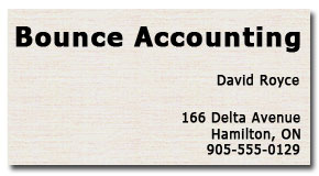
 Example 3.1 Example 3.1 When you read this card does your eye simply wander off the card after you read the phone number? |
|
|
Example 3.2 When you get to the phone number in this card your eye instinctively jumps back up to the top of the card again. Your eye will actually continue to bounce between the two bolded elements while your mind absorbs what it sees. This is due to the framing effect of the company name and phone number both being large and bolded. |
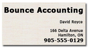
This is one of the ways designers use repetition to control the reader?s eye. The bold elements frame and unify the piece which in turn keeps the reader?s attention for as long as possible by trapping the movement of their eyes and preventing them from falling off the page too quickly. When something is repeated, the eyes will instinctively stop and look for other repeating patterns to compare them.
4. Repetition Includes Definition
You may already use repetition in your documents, but to take it from barely noticable to truely effective, you have to take it up a notch and clearly define your repetitive elements. This will make your page not only more interesting to look at, but also more consistent and easier to navigate.
Don?t forget that spacing is an important element that heavily depends on repetition. If you have a one line space between a title and the first paragraph, then keep this consistent. If you use a 10 pixel spacing border around photos, then keep this consistent.
|
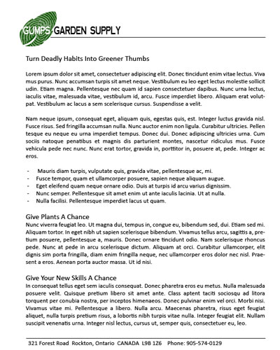
Example 4.1 For repetition to work it needs to be clearly visible which is not the case with the article at right.
The subtitle font sizes are not well defined and this reduces their effectiveness.
|
|
|
Example 4.2 In this example we change the font to something more dramatic but it still required definition which is what the line spacing accomplishes. Now each line space helps to define subtitles.
One simple change makes this document so much easier to scan and read? If you lived in Ancaster you would immediately want to know what they are saying about your town which draws you into reading the article. Unlike the example above that makes it hard to even find the word Ancaster.
|
|
|
Example 4.3 If you didn't want the fonts to be so bold and dramatic as in Example 4.2, you can instead use a defining graphical element like the one at right.
Repeating graphics like this along with the spacing are an effective way to help define subtitles.
Since the larger graphic is defining a main title, it becomes obvious to the viewer that the smaller versions are defining subtitles.
Amazing how just a simple graphical element makes this document so much more interesting and readable. |
|


5. Repetition Includes Graphics
| Graphics provide a fun use of repetition |
|
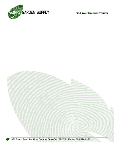
Example 5.1 This is a typical letterhead with a simple layout and a lot of content. Don't try to actually read the example article because the paragraphs are just gibberish words.
Even with effective strong alignment, will people be motivate to read this article or will they avoid it? With this much content, does it look interesting and engaging or dull and boring?
How can this article be redesigned into something lighter and more engaging, without loosing the consistant look and feel?
|
 |
|
Example 5.2 We will start by removing the content temporarily, then enhancing the design, and adding a slogan to the page. The green leaf is a graphic design element this company can make more use of.
First we will make a very large copy of the leaf and then flip it so there is variety in the design while still maintaining unity. Then we will push the leaf off the page slightly. These two combined effects eventually help the content to appear to be much less then it really is. We also want this graphic to be a watermark, as shown at right, so the text can be read overtop.
If this is for your website, you can create these watermark background graphics in a photo program or ask us to design it for you. It can then be inserted as a table cell background image which allows you to type text overtop.
|
 Make your background watermarks between 15% and 25% opacity to be effective. Lighter colored backgrounds can be set to about 25% and darker backgrounds set to about 15%. The effect you are after is to make it dark enough to be seen and understood but light enough to avoid conflict with the text you are going to type overtop of it. |
| Example 5.3
Now we can insert the content back into the page and complete a few more changes, starting from the top.
Make the article's title larger and color it green to maintain consistency with the logo. Add an extra line space below it to help it stand out even more.
Use a much smaller version of the leaf graphic for the bullet points that are shown half way down the page.
Make the subtitles bold and a slighly larger font compared to the paragraph text but do not make them green which would compete with the other green elements on the page.
Add the leaf again at the bottom left beside the address to compliment the larger leaf in the logo above. This has the effect of bouncing the readers eyes back to the top again because they will compare the leaves. |
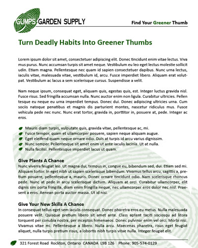 Now the article is engaging and more interesting. We have accomplished this without adding any photos which would help even more. Readers can quickly skim over the page and decide if they want to read it. This gives you the opportunity to pull them in with your bullets and sub-titles. |
|
Example 5.4 The article at right could be a webpage. The large background watermark is inserted as a Table Cell Image Background. The graphic was set to 20% opacity.
With the title text larger, the subtitles are little larger compared to Example 4.3 above, and the watermark, this article is a lot more interesting to read.
|
|
As shown above, you can choose a graphic in a design and create a new design based on it. Usually something simple is best. Try simple shapes such as circles, squares, or triangles. Take an element you like and create new designs by playing with it. If you have a very familiar element that people can easily recognize, such as a logo element, then all it takes is part of the logo to create unity in the document. Just be careful that you don?t overdo repetition. It is best to vary the elements you are repeating somewhat, so the repetition is not overwhelming. If you vary the colour, then keep the shape; if you vary the shape, then keep the size; and so on.
Summary of Repetition
Repetition is the idea of bringing visual elements into your work and then repeating them, giving the impression of a strong unified piece. This is because the repeated elements visually tie the otherwise separate parts together. Repetition is very important in a single page document, and is vital when creating a multi-page website.
Why use it?
Repetition has three purposes: to unify and connect your elements, to create more visual interest, and to help a person navigate your content. The more interesting your document looks, the more it gets read.
How to use it?
The best way to use repetition is by simply pushing elements such as titles, spacing, and graphics, just a little further. Be bold! Be dramatic! Try new ideas, experiment, and see what you can come up with.
Consider adding elements such as graphics solely for the purpose of creating repetition. Start by making the current elements stronger, such as titles and subtitles. Then as you get more comfortable, try introducing new elements. This helps to both enhance the design and tie your piece together.
| Websites need consistency |
Think of repetition like accenting your home. If the floor, walls, couches, and cabinets are all white, then adding an accent and repeating it is like adding a red area rug, red lamp shades, and red flower vases. If I then added a brown table, it would look out of place because the color is not repeating. Note to yourself: a white house with red accents is not a suggestion you should consider, unless you really enjoy the candy cane christmas look.
What to avoid
Avoid repeating elements to the point where they becomes overwhelming and irritating. If they detract from the content, they are too much. Repetition should help people focus on your content, not repel them. Sometimes it is best to ask another person's opinion to make sure you have the right balance.
Repetition, although instinctive, must be taken to the next level, which will often take you out of your comfort zone. Don?t be afraid to experiment and try new things. Repetition will help turn your work into a comprehensive and integrated website that is more interesting and easier to read and navigate.