|
Alignment refers to the placement of elements on a page in such a way that a visual connection is established between them. One of the easiest and quickest ways to turn a messy unprofessional page into a designers masterpiece is to use Alignment.
Amateur designers often insert content wherever it will fit on the page with little regard to how one element aligns with another. This approach becomes a visual distraction that results in confusion.
Example 1.1 illustrates this problem clearly with an actual website we discovered. Instead of the elements pulling together into a unified message, this page is a confusing mess that repels your eyes.
When the viewer cannot distinguish a relationship between elements, it hinders them from prioritizing information they are looking at. Content will appear cluttered and confusing. The use of alignment acts like glue that builds relationships between elements and gives the reader a way to interpret what they are seeing. Luckily, alignment is generally easy to fix.
In the Proximity tutorial we discuss how related elements are grouped together and unrelated elements are spaced further apart. Alignment is the principle that builds relationships between these seemingly unrelated elements, so they all function with one clear purpose. When elements are aligned correctly, an invisible connection is established between them. The reader?s eye interprets this connection to mean that although they are separated by space, they are still connected in some way.
Take a look at the next set of flyers arriving in your mailbox and you might see ones like the two examples below. Inexperienced designers sometimes create flyers such as these, giving little thought to alignment. This tutorial will show you how to fix this flyer so it looks professional and even gives you extra space to add more elements without looking cluttered.
The fun of alignment is that it is a hidden principle to the untrained eye, but once you understand it, you will see it everywhere! Thankfully alignment is one of the easiest principles to apply and any alignment often pays immediate dividends.
This is the most common form of alignment because most people learn it in school at an early age. It is very organized and secure because it feels traditional, familiar, and comfortable for the viewer to read and understand. It is also the easiest to create because it is the default alignment in most computer programs, including Web browsers.
It is called 'Flush Left' alignment because the text is anchored on the left side and extends out to the right side where it is not aligned.
Flush Right Lines
This is a less commonly used alignment and feels less traditional to the viewer. It can present some problems for you when you want to use bullet lists which by default are left aligned.
NOTE: Flush right is not a default alignment which means that you will have to use the Flush Right icon in your SiteApex editor.
Centered Lines
Center alignment is when an element on a page is visually centered in relation to another element on the page. It could be centered vertically or horizontally. It could be a photo, words, paragraphs, boxes, or lines that the elements are centered with.
When paragraphs are center aligned like this one, they have an invisible line down the middle and words extend out from that center point. This creates a soft edge on both the right and left sides of the paragraph because they are not as hard and straight as the edges of other alignment methods as is the case in the paragraphs further down this page.
As a result, long paragraphs with soft edges are more difficult to read.
since your eye has to keep finding it's
place in long sentences.
If however the center aligned content
is short, it can be an effective method to use.
Center alignment is the most common alignment beginners will use to add importance to their content because it seems like a safe method for adding style and emphasis to their designs. However, the results are often boring and amateur, looking more like a wedding invitation. Flush left and right alignments provide much stronger connections and can quickly give your page a professional looking layout.
NOTE: Centered alignment is not a default alignment which means that you will have to use the Center alignment icon in your SiteApex editor.
Justified alignment is a combination of both left and right alignments creating a squared-box-like edge. This option looks more formal than other layouts. Newspapers and magazines will often align their content using this option.
This alignment works by adding additional spacing between words, and sometimes letters, to stretch the text from side to side. As a result, this alignment requires extra planning because areas that are too narrow for the text may cause large gaps between words making it appear disjointed.
You can try using it, but depending on the margin width, font size, and length of words, you may need to use another alignment.
NOTE: Justified is not a default alignment which means that you will have to use the Justified icon in your SiteApex editor.
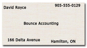
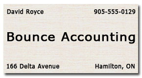
 When elements on a page are not aligned properly, the reader's eyes will instinctively see a problem even if not immediately recognized. In Example 3.1 some elements of the business card are flush left, some are flush right, and some are centered, however, not one element is visually aligned to any other. As a result, the text placement looks unplanned and disjointed. When elements on a page are not aligned properly, the reader's eyes will instinctively see a problem even if not immediately recognized. In Example 3.1 some elements of the business card are flush left, some are flush right, and some are centered, however, not one element is visually aligned to any other. As a result, the text placement looks unplanned and disjointed. In Example 3.2 the difference is quite amazing. By simply aligning the text, we can make it look so much better. Instead of the text looking like it was thrown on the card, it now looks well laid out. This may not be the nicest looking card, but it is a big improvement over Example 3.1 next to it.
Of course, Example 3.2 is not a great looking business card, but it shows you how alignment can help it look better. The company name font was enlarged so it is now justified on both the left and right side of the card. This visually completes the connection between elements that are above and below it.
Center alignment is more difficult to master but is effective when used properly. When centering text you will be tempted to keep the lines balanced in length so the left and right edges are as straight as possible, however, this is the wrong approach as you will see in the following examples. The key to using center alignment is to make it obvious. Emphasize the alignment and experiment with colour, font, style, and graphics.
The 3 most important words we focused on in the previous examples were; Save, 50%, and Sale.
|
 Example 2.1
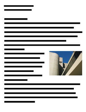
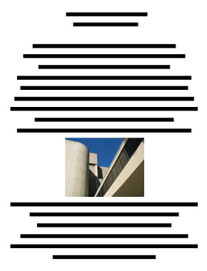
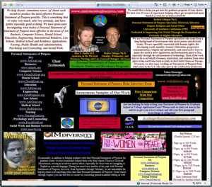
 Example 5.1 Example 5.1In this example, most elements are not aligned with each other. The top and bottom elements are aligned with the edge of the page but not aligned with any other photo or text element.
The authors names are left aligned to the photo but not aligned with any other element, and therefore look out of place. They are also not aligned with either the top or bottom of the photo which would have helped.
Another problem is the brown box which cuts the page in half instead of framing the words. |
Ineffective Alignment
|

|
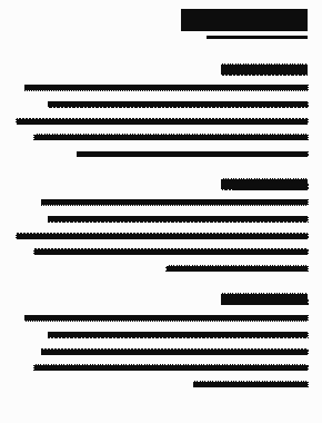
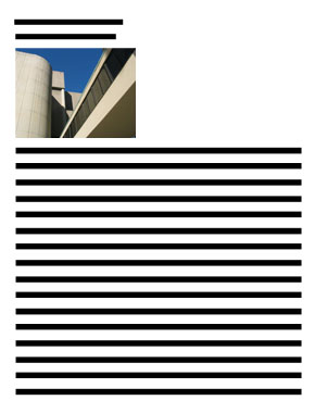
Example 5.2 In this example, left and right alignment is used more effectively.
Notice too that the top and bottom edge of the photo is lined up with the top and bottom edges of the title and slogan.
With the vertical brown box on the left, it anchors vertical alignment and differentiates the text on either side. The right side text is only about the article itself.
|
Effective Alignment
|
|
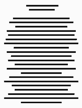
Example 5.1 In this example, most elements are left aligned except down the center of the page.
The brown boxes now frame the page and add emphasis to the descriptive text in the middle.
The authors names are actually right aligned, while the other elements are left aligned. |
Effective Alignment
|