|
 1. Proximity Includes Grouping 1. Proximity Includes Grouping
Groupings are visual links between related items. You can accomplish these links with many design methods as long as items are visually connected. Groupings are most commonly defined in documents by the way you use indents, spacing, lines, colour, shapes, and fonts.
 Example 1.1 Example 1.1
|
Example 1.2
|
My Favourite Food
Apples
Pasta
Cupcakes
French Fries
Bread
Pumpernickel
French
Cinnamon |
|
|
My Favourite Food
Apples
Pasta
Cupcakes
French Fries
Bread
Pumpernickel
French
Cinnamon |
|
When you group items correctly the reader will have visual clues to move through your text. This helps them organize their thoughts while reading it. The following examples illustrate this point clearly. Example 1.1 is a difficult list to decipher. There appears to be no title and your eye treats every item in the list as equal when in fact they are not. When a reader cannot visually see groupings they will often get confused and quickly lose interest.
We can see from Example 1.2 that the first line is a title and the last three items in the list are actually types of 'Bread' and not exactly equal with the rest of the list. As a reader, we instinctively understand that indents and font changes are a form of grouping and we are able to quickly interpret their reason for being there.
 |
|
Similar yet different! |
For the sake of clarity during this tutorial, elements can be anything from a single item, to a group of items, a graphic, a photo or group of photos, or even two or more of elements grouped together. Elements are really anything that is given some distinction on your page, whether a lot of distinction or a little. They may be similar and they may be different.
In Example 1.2 there are three elements; the title, the main list, and the bread sub-list. If a similar list was added under this list and we called it 'My Least Favourite Food', then each list would be a seperate element on the page with sub-elements. If a photo of a breadstick was added, this would be a third element. As you progress through this tutorial, you will begin to breakdown your designs into elements that either needs to be grouped or separated to make a more effective document or webpage.
 2. Proximity Includes Spacing 2. Proximity Includes Spacing
| Relationships determine spacing |
Although the spatial distance between elements on a page may seem unimportant, it is in fact helping readers subconsciously interpret your content, even before it is read. Spacing between related elements should always be less than elements not directly related. Determining what is related and what is not is sometimes not easy. The best way to determine relationships is by forcing yourself to categorize and group items by type and importance.
|
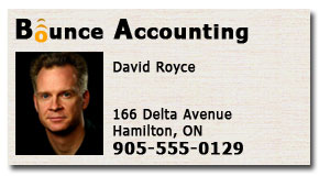
A typical business card can be divided into several elements which all need extra space between them. In this business card at right there are four distinct elements clearly seen. They were grouped and spaced accordingly:
-
Company logo top left
-
Photo left with 'white space' far right for contrast
-
Person's name
-
Contact information
|
Example 2.1
|
In the examples below, the items are being categorized into groups. However, the groups were not visible to the reader until spacing was added. Line spacing defines groupings by visually pulling some items together and therefore pushing others further apart. Once groupings are established, your page is much easier to read, navigate, and understand.
Example 2.2
This list is difficult to decipher because every item has the same amount of spacing. The bolded items could be headers or perhaps just a more important item in the list. There is no easy way to tell. |
Example 2.3
Items in this list are now grouped, which tells the reader's eye that some items are related and therefore closer together. Notice also how the bolded items now stand out as headers and help to further define the groups. |
|
Canned Goods
Baked Beans
Soup
Tomato Sauce
Canned Fruit
Pasta
Spaghetti
Fusilli
Lasagna
Spices
Oregano
Basil
Parsley
Garlic Powder
Ginger
Cinnamon |
|
|
Canned Goods
Baked Beans
Soup
Tomato Sauce
Canned Fruit
Pasta
Spaghetti
Fusilli
Lasagna
Spices
Oregano
Basil
Parsley
Garlic Powder |
|
As you are beginning to see, spacing is an important element of proximity. When grouping objects on a page there needs to be extra space between unrelated groups. A very common misconception is that having extra space (or 'blank space?) on your page is 'wasted space'. As the next set of examples will illustrate, this is usually not true.
Consider both advertisements below. Which one are you more inclined to read? If you are not inclined to read Example 2.4 then which advertisement is the 'real' waste of space? Having extra space within your content is a powerful element to use for enticing a person to read your content.
Example 2.4 |
Example 2.5 |
|
|
KITTENS! New Calico kittens have been born at 123 Smith Street. Very well mannered and playful kittens need a new loving home. They are all fully vaccinated and been given a clean bill of health by a vet. There are three available, two girls and one boy. They are great with children and enjoy people. Call now! To schedule a meeting call 905-555-3100 and we will arrange a get together as soon as possible. |
|
KITTENS!
New Calico kittens have been born at
123 Smith Street.
Very well mannered and playful kittens need a new loving home. They are all fully vaccinated and been given a clean bill of health by a vet. There are three available, two girls and one boy. They are great with children and enjoy people. Call now!
To schedule a meeting call:
905-555-3100 and we will arrange a get together as soon as possible. |
|
Why is spacing a major factor in getting a person to read your document? It turns an otherwise clunky chunk of content like Example 2.4 into smaller and more manageable bite-sized pieces for the reader to absorb like Example 2.5. It is why this tutorial is divided into small paragraphs with lots of space.
 Spacing can set items apart or establish relationships between them. If items are spaced the same way, it is assumed they are similar in nature and equal in importance. Quickly look at Example 2.5 below. You instantly know that the last column on the right is somehow different from the other columns simply because it is spaced further apart from the others. Your mind will instinctively ask the question 'Why?' and you will look for a reason. This example does not give you a reason.
If you space elements without reason it can create questions with no answers.
This leads to confusion for the reader who is trying to understand what the extra space means.
Did you wonder why the above two sentences were spaced as they are? This shows you how powerful spacing can be. For the Class Schedule shown below we need to offer readers an explanation for the spacing such as "Core courses are at left and optional courses at right". Of course, spacing can work against you if the reason is not clear, so be deliberate about how you space.
Example 2.6 |
Class Schedule
|
Art
Room 112
Room 203
Room 107 |
English
Room 113
Room 204
Room 108 |
Math
Room 114
Room 205
Room 109 |
|
Gym
Room 117
Room 207
Room 102 |
|
|
3. Proximity Includes Header Spacing
It is important to separate your headings using adequate spacing to help a reader interpret and navigate your page.
Example 3.1
In this example, the headings and paragraphs are spaced equally which causes confusion. A reader will not know if the city name headings belong to the paragraph above or below.
This incorrect use of space tends to push elements apart instead of pulling them together into logical groups of information. Groupings create unity which requires separation. Seems illogical but is true. The use of this kind of spacing results in 'trapped space' which is to be avoided (see explanation about trapped space below). |
Example 3.2
In this example, headings and paragraphs are spaced differently which helps to organize the reader's thoughts as they interpret the text. Now it is obvious the city headings belong to the paragraph below.
When headings are moved closer to the paragraphs they belong to, the proximity establishes a strong relationship making the page look unified and the spacing is no longer trapped. A reader is easily guided down the page from heading to heading without confusion. Incredibly the page doesn?t look as crowded even though it is actually using less overall space. |
Great News Newsletter
The regions centre for good news articles because a lot of great news is happening all around us.
Stoney Creek
A new private school opened its doors today to provide Christian Education in the area.
Ancaster
Financial planners in the area held a weekend series of seminars to help people prepare for changes in the industry.
Hamilton
Local construction company invests in a new roofing system that will help home builders create stronger houses.
Dundas
Area residents look forward to the new movies being shot in the downtown core. The town has experienced several face-lifts and an influx of building projects. |
|
Great News Newsletter
The regions centre for good news articles because a lot of great news is happening all around us.
Stoney Creek
A new private school opened its doors today to provide Christian Education in the area.
Ancaster
Financial planners in the area held a weekend series of seminars to help people prepare for changes in the industry.
Hamilton
Local construction company invests in a new roofing system that will help home builders create stronger houses.
Dundas
Area residents look forward to the new movies being shot in the downtown core. The town has experienced several face-lifts and an influx of building projects.
|
|
CAUTION: Watch for and avoid Trapped Space.
This is sometimes hard to see and needs to be avoided because it hinders a reader's ability to interpret your document. In Example 3.1 the spacing is the same between headers and paragraphs which is causing confusion. Instead of the line spacing helping to define your headers and paragraphs, it is being treated as an equal item on the page. As a result, the line space is considered 'trapped'. Spacing needs to define other elements to avoid being trapped. |
To help you spot problems with your spacing, try replacing it with lines or blocks of colour. In the next two examples we have replaced the line spacing with grey lines to see what effect our spacing is having on the text. Will the lines help to define or detract from the other elements?
Example 3.3
You can see here that the lines are a distraction making the document even more confusing |
Example 3.4
These lines make it easier to interpret the content which means your spacing is correct. |
Great News Newsletter
The regions centre for good news articles because a lot of great news is happening all around us.
Stoney Creek
A new private school opened its doors today to provide Christian Education in the area.
Ancaster
Financial planners in the area held a weekend series of seminars to help people prepare for changes in the industry.
Hamilton
Local construction company invests in a new roofing system that will help home builders create stronger houses.
Dundas
Area residents look forward to the new movies being shot in the downtown core. The town has experienced several face-lifts and an influx of building projects. |
|
Great News Newsletter
The regions centre for good news articles because a lot of great news is happening all around us.
Stoney Creek
A new private school opened its doors today to provide Christian Education in the area.
Ancaster
Financial planners in the area held a weekend series of seminars to help people prepare for changes in the industry.
Hamilton
Local construction company invests in a new roofing system that will help home builders create stronger houses.
Dundas
Area residents look forward to the new movies being shot in the downtown core. The town has experienced several face-lifts and an influx of building projects.
|
|
4. Proximity Includes Eye Navigation
If you ignore the proximity principle, and do not group items, a reader's eye will not know how to follow your content logically. People look for logical steps in a document but if there are no groupings, their eyes will wander aimlessly until they lose interest.
| Spacing can create navigation points |
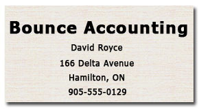
Effective layout is achieved when you are able to guide a person through your content. To accomplish this there must be an entry point and navigation points established with groupings. In this case, a large bold heading used in the two business cards below create a good entry point for the reader's eyes. Now we just need the navigation clues for them to follow a logical progression of important details until they finish scanning the whole card.
|
There are no navigation clues in Example 4.1. Text lines below the title are equally spaced and as a result, a reader's eye movements are undirected through the text and therefore erratic, as they try to find what is important to remember, like the person's name. Spacing is noticeably trapped between lines because it is not being used correctly.
|
Example 4.1
|
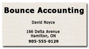
Example 4.2
|
Example 4.2 has related items grouped together and unrelated items spaced further apart. If you were handed this business card to read, your eye instinctively knows how to navigate the content quickly. If you were standing in front of the person who gave you this card, having his name spaced apart from other elements is very useful. |
5. Proximity Includes Styling
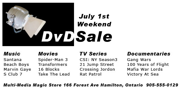
Sometimes people sacrifice proximity in a design because they want to go for a style that is fun and unhindered. However, ignoring principles such as proximity will only make your document more difficult to understand. Achieving a fresh new style does not mean throwing away the design principles but rather using them in ways to achieve the look you are after. Take a look at the next two flyers and decide which one is going to be more effective.
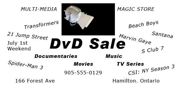
Example 5.1
This first style is what could be called the 'Yard Sale Flyer' style. |
|
The designer is trying to accomplish a fun and energetic design, but it ends up looking crowded and confusing. Most of the space is 'trapped' because it has no relevance. It is difficult for any reader to interpret this advertisement and find answers to the following questions.
- Where is the above DVD sale taking place?
- Is it a 'Magic Store' or a 'Music and Movie Store'?
- What day will the sale take place?
- What are the different types of DVDs on sale?
|
If every item on a page is attempting to grab a reader's eye then nothing will grab it and this causes confusion. There needs to be a flow of importance that can be accomplished with the principle of proximity. Even the store name above is divided and not in close proximity to itself.
The flyer in Example 5.2 is much easier and more interesting to read. The first thing your eye notices is the use of space. The top right is intentional 'blank space' (often referred to as 'white space') to draw more attention to the left side grouping of elements. This takes advantage of the principle of contrast supporting the principle of proximity. Key information such as the sale date, items on sale, and location of sale are now easily found due to the placement of each element.
Example 5.2
The principle of proximity is now applied to control the elements on the flyer which are supported by the principles of alignment and contrast. |
|
|
The flyer in Example 5.2 is more readable because there is an order of importance for each element. You therefore instinctively know what information to ignore until other questions are answered first. For this type of store, a potential buyer does not care where the sale is until they know if what is being sold is what they want to buy. So some elements are less noticeable while other elements are more noticeable due to their importance.
 Notice too how the list of DVD's in Example 5.2 are closer to their category names so readers see the relationship and are not confused by the address and phone number below. Using the principle of proximity also gives the designer additional space to include a few more titles under each category without the flyer looking crowded.
Sometimes you have to manage a crowded design when adding extra space is not an option. This is when other styling methods for grouping elements are useful. These include indents, lines, colours, shapes, and fonts. The following set of examples below illustrate how you can use each of these to achieve grouping without spacing.
Notice that there are two major groups (Cars and SUVs), and two minor groups in each. Of course not all combinations of styling will be to your liking or suit every document but these examples illustrate the variety in which you can use them.
Example 5.3
Indents,
Font bolding |
Example 5.4
Indents,
Font bolding,
Lines |
Example 5.5
Indents,
Colour,
Lines |
Example 5.6
Colours,
Font bolding |
Example 5.7
Colours,
Font size,
Indents |
Example 5.8
Colours,
Font size,
Shapes |
Cars
Honda
Civic
Accord
Prelude
Toyota
Prius
Celica
Tercel
SUVs
GM
Hummer
Trailblazer
Tahoe
Ford
Bronco
Explorer
Expedition |
|
| CARS |
| Honda |
|
Civic
Accord
Prelude |
| Toyota |
|
Prius
Celica
Tercel |
| SUVs |
| GM |
|
Hummer
Trailblazer
Tahoe |
| Ford |
|
Bronco
Explorer
Expedition |
|
| CARS |
| Honda |
|
Civic
Accord
Prelude |
| Toyota |
|
Prius
Celica
Tercel |
| SUVs |
| GM |
|
Hummer
Trailblazer
Tahoe |
| Ford |
|
Bronco
Explorer
Expedition |
|
| CARS |
| Honda |
|
Civic
Accord
Prelude |
| Toyota |
|
Prius
Celica
Tercel |
| SUVs |
| GM |
|
Hummer
Trailblazer
Tahoe |
| Ford |
|
Bronco
Explorer
Expedition |
|
| CARS |
| Honda |
|
Civic
Accord
Prelude |
| Toyota |
|
Prius
Celica
Tercel |
| SUVs |
| GM |
|
Hummer
Trailblazer
Tahoe |
| Ford |
|
Bronco
Explorer
Expedition |
|
 CARS CARS |
 Honda Honda |
|
Civic
Accord
Prelude |
| Toyota |
|
Prius
Celica
Tercel |
 SUVs SUVs |
| GM |
|
Hummer
Trailblazer
Tahoe |
 Ford Ford |
|
Bronco
Explorer
Expedition |
|
There are other styling methods using graphics with the principle of proximity to help a reader navigate your page and place importance on specific elements in your design. By taking the same elements in Example 5.2 and rearranging them differently, we are able to direct a reader's eye to two specific categories, as shown in Example 5.9.
Example 5.9
Just as a theatre uses spotlights to draw attention on the most important actor at any given moment, we are using graphics to highlight DVDs that generate the most interest and possibly bring in the most buyers; Movies and TV Series. Prominent graphics in close proximity to text will draw the reader's eye there first, making it the most important element. |
|
|
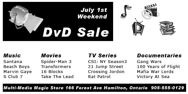
Another option is to find a graphic which illustrates each of the four categories. In this next example, we place these graphics in the flyer. However, just adding graphics is not the only criteria. Although these four new graphics indicate to the reader these types of DVDs are offered, the reader cannot easily associate them to the categories they belong to and their usefulness is diminished.
Example 5.10
Graphics are great help to readers when they support the message of the text. In this flyer they are too far away from the categories they are trying to support. |
|
|
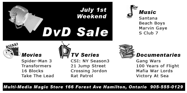
A better use of these graphics is to incorporate the principle of proximity. By moving the graphics closer to their respective categories and leaving enough space between them and the next category we establish groupings. Now the reader is able to quickly identify the groups without even reading the headers. To enhance the idea of many DVDs on sale we did not box in the DVD categories with a dark background or outer border, like the rest of the content. The reader now gets a sense of limitless space around the DVD titles, which could mean there are more DVDs on sale. If the designer put boxes (lines or shading) around each category, it would look like those were the only DVDs on sale.
Example 5.11 |
|
|
6. Proximity Includes Website Navigation
The proximity principle is also a big help in website design. By collecting elements into logical groups, you make your website much easier to navigate and understand.
Example 6.1 |
BestWeb Design Specialists
| About Us Portfolio Clients Testimonies Support Contact Us |
AG Construction CCS School Burlington Financial Planners Hamilton SPCA More
It has not been exciting to see our website design business grow from two clients to only four. We don't really know why is hasn't grown faster but we would like you to consider using our services to grow your business. We can design for you an adequate website with lots of links. Please contact us to take a look at the rest of our website design portfolio. We look forward to showing you. Brandon Bain shown outside a client's office is ready to assist you. "The Internet offers endless possibilities for those who will embrace the constant changes" - James F. Byrnes
|
The information on this webpage seemsat first glance to be clearly laid out, until the reader tries to interpret it. They will soon discover that their eyes have deceived them. Thesecond line of links (starting with AG Construction) appears to be just another line of links with no relationship to the links above it, whenin factit is a sub-link ofthe Portfolio link above.
As a result, the font and colour styling of the Portfolio link looks like a mistake when in fact it was an attempt by the fictitious designer to help people know which area of the website they were in. If you look closely, you will realize that this page is actually showing you the 'More' page which appears to have no relationship with the Portfolio link. Do you see the confusion now?
What about the quote or the photo description? It is difficult to see them at a glance without reading the whole page. It even looks like James F. Byrnes is the person in the photo when in fact it is Brandon the staff member. James wrote the quote. |
Example 6.2
|
BestWeb Design Specialists
|
About Us
Portfolio
AG Construction
CCS School
Burlington
Financial Planners
Hamilton SPCA
More
Clients
Testimonies
Support
Contact Us
|
|

|
|
Brandon Bain outside a client's office is ready to assist you
|
It has been exciting to see our website design business grow from two clients to now over four hundred websites. We know why it has grown so fast and we would like you to consider using our services to grow your business too. We can design for you an amazing website that captures attention. Please contact us to take a look at the rest of our website design portfolio. We look forward to showing you.
"The Internet offers endless possibilities for those who will embrace the constant changes"
- James F. Byrnes |
|
|
This updated webpage has a few proximity changes to make the website easier to understand and navigate. By simply following the proximity principles, this site has been changed from a confusing mess into a visually appealing page that will not frustrate your website visitors.
-
Page navigation is now vertical and section names are spaced apart.
-
Sub-pages have been grouped under their respective sections names. This makes it easy to interpret the relationships between webpages.
-
A line space was added between the quote and the paragraph, which helps the quote to stand out.
-
The photo by-line is now just under the photo instead of buried in the paragraph beside it.
|
Summary of Proximity
When items are in close proximity to each other they become a visually connected unit rather than several disconnected units. When creating a group, put items that are related together. Learn to be conscious of how your eye travels on a page. Where does it start? In what order does it view the content? You should be able to follow the content logically through from a definite beginning to a definite end, even without reading the words.
Why use it?
The principle of proximity primarily creates organization, which leads to visual appeal. When a page is organized people will be more drawn into reading it. Don?t crowd your content, use spacing to separate and draw attention. Does the proximity of elements promote or hinder the visual appeal? Should they be grouped differently or further apart?
How do I use it?
Squint your eyes slightly so you cannot read the page, and count the number of visual elements you see, which is how many navigation points you have. You can have to many or not enough depending on the type of document it is. If you feel you have too many, try grouping smaller elements into larger elements.
What to avoid
The bottom line?
At a simple quick glance, we receive a truly amazing amount of information from the proximity of the elements on a page, even before we read one word. This is why it is important to group related items together and space everything properly. It makes your content neat and easy to read because the reader receives clues about what is going on and how to navigate the page.
|